shalokshalom they take up a lot more space
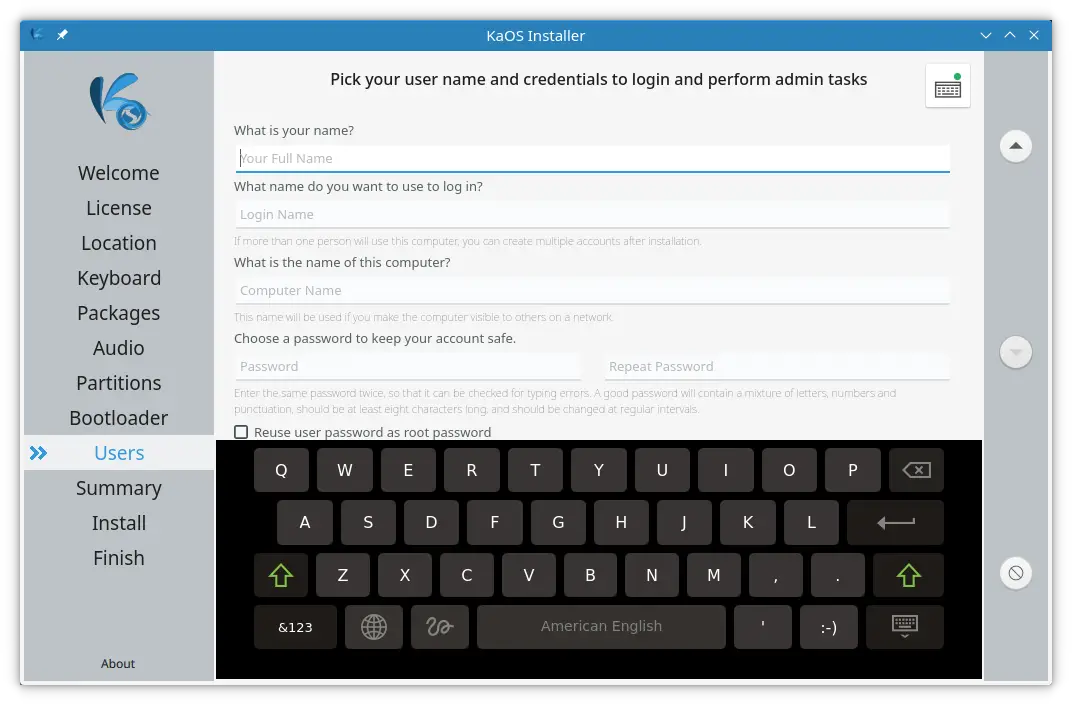
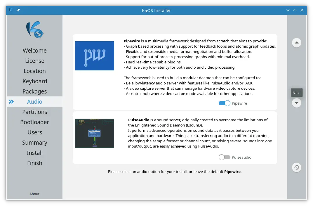
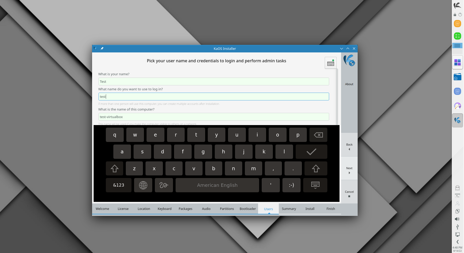
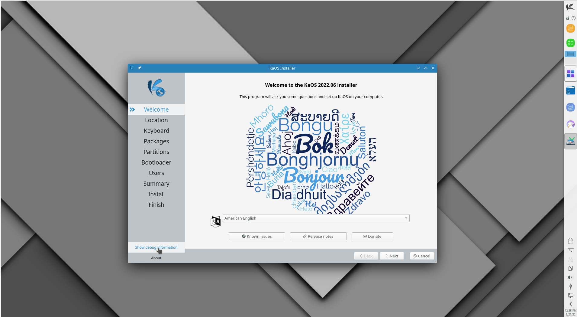
Not clear how you come up with that, sidebar is not even 1/3 of the old sidebar, bottom bar is slightly smaller (narrower) then old bottom (navigation bar). So there is now way more focus on the actual modules (they can now use 90% of the available space, instead of about 70 %).
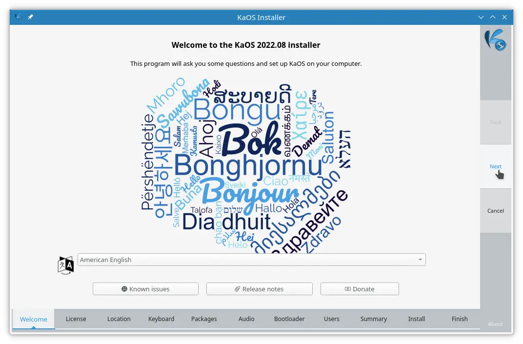
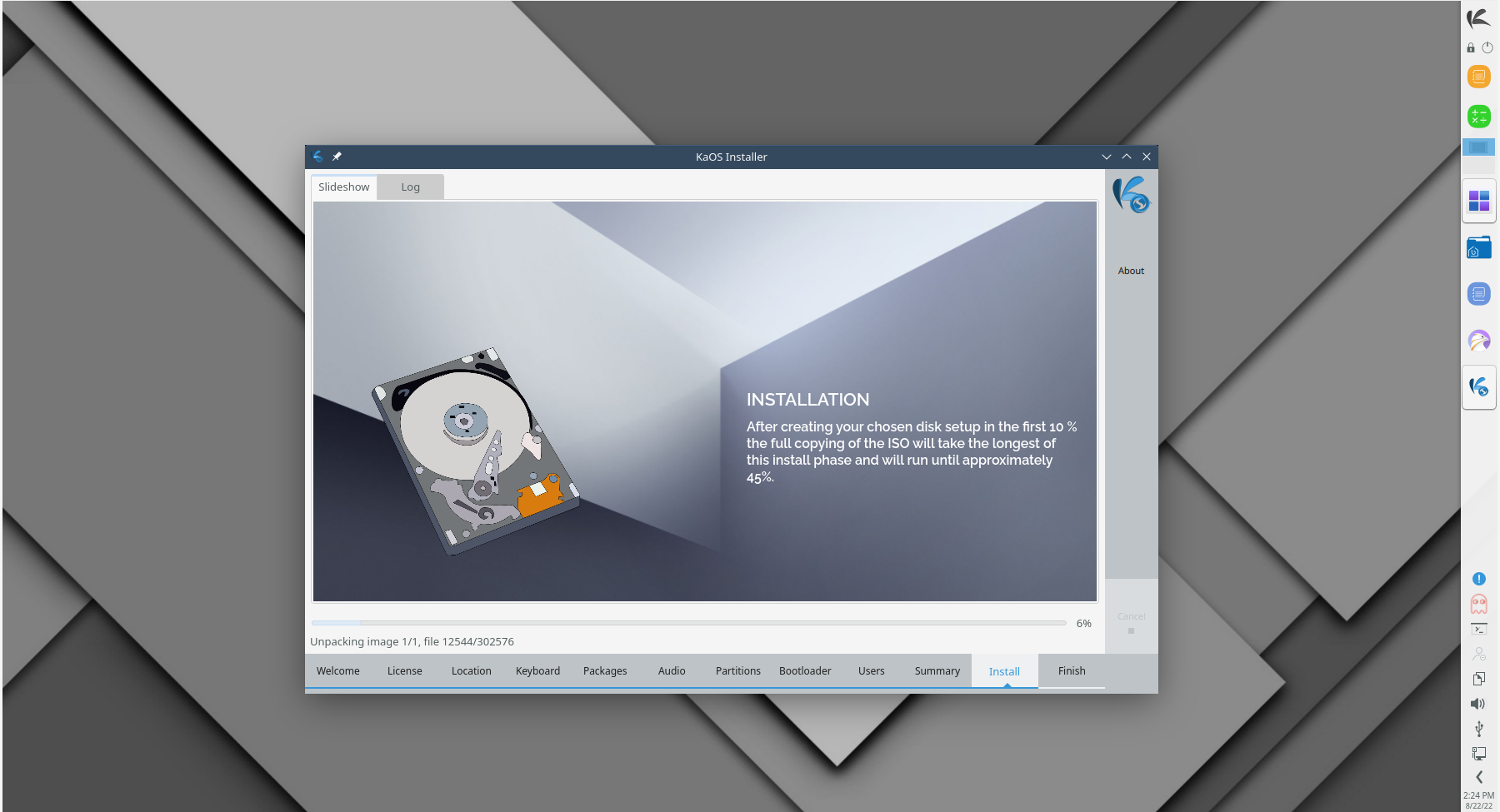
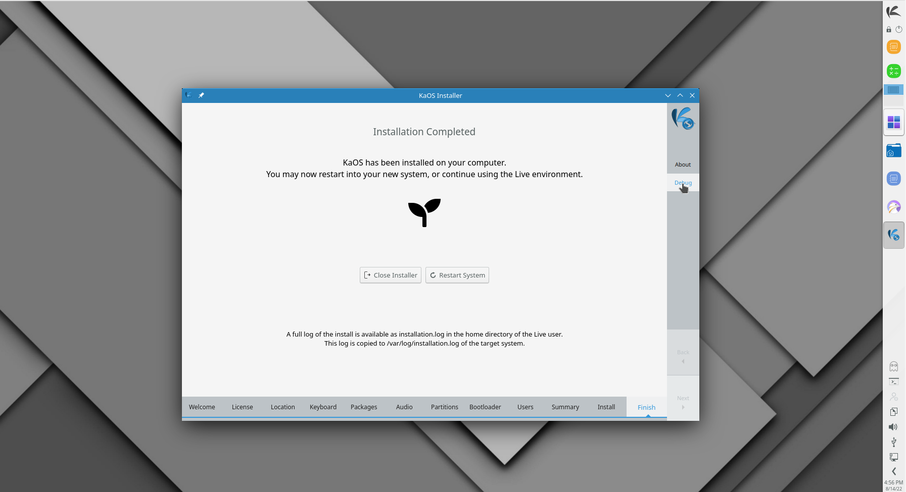
Bottom is completely full this way, remember that all modules have to show, in different languages, English is general the shortest of all texts. During all testing, I don't enable the partition module for example, so that text is added in the final version. See image below.
You probably missed there are 5 buttons & and the logo (in that 1/3 of the space).
But, in the end changes will be hated by some liked by others......
Compare that with old way:
 https://kaosx.us/img/2022/welcome.png